A sharp technology recruiter that looked like everyone else, re-engineered for launch.
Hyperloop Recruitment did sharp work and looked like every other firm in its category. We built a high-contrast, kinetic identity around one symbol, engineered to hold from sixteen pixels to sixteen feet, and applied it across digital, print and the office itself.
Sharp work, a generic face.
Hyperloop is a technology recruiter. The work it did was sharp, and the brand around it looked like every other recruiter in the category. For a firm whose value is judgement about people, an interchangeable face undercuts the pitch before the first conversation starts.
The brief was a launch: a rebrand and a new identity that would let the firm look like the calibre of work it already did.
One symbol, from sixteen pixels to sixteen feet.
We built a kinetic identity around a single symbol, engineered to hold at every size the brand would meet, from an app icon to a sixteen-foot wall. The symbol is a continuous loop, and the wordmark carries the same form inside its own letters, so the name and the mark read as one piece of engineering.
Holding at sixteen pixels is the harder test. At that size there is no room for detail, and the loop had to stay legible as a shape on a phone home screen as well as on a sign.
High contrast, held on a dark ground.
The identity runs high-contrast on a dark ground, with a soft corporate gradient behind it and three accent colours, Coral Red, Azure Blue and Aqua, used sparingly against it. Syne carries the typography across communications, from headlines to body copy, in weights from regular to bold.
The identity, applied.
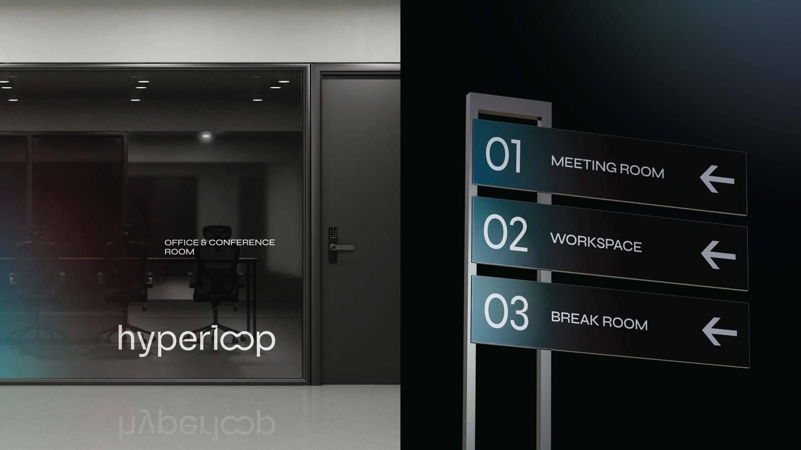
The system went out across the touchpoints a recruiter lives on: business cards and stationery, the digital product and its search, and the office itself, where the wordmark and numbered wayfinding signs carry the same dark, high-contrast finish from the glass wall to the meeting rooms.
What changed.
Hyperloop launched with a recruitment brand that finally looks like the calibre of work behind it, one high-contrast system that holds from the app icon to the office wall.
Read it on pivitt.co.uk